It’s that strange time between Christmas and New Year, when we get to look both to past and future. So, I’m going to be doing just that very soon. But for today, let’s look to the future. Specifically, to the Pantone Colour of the year for 2019.
Now, you may have seen this announcement a couple of weeks ago. And, as with every colour of the year, you may love it or you may hate it. But for 2019, Pantone predicts we are going to be seeing a lot of ‘Living Coral’.
Personally I love it! Looking back over beading patterns, this is a colour I’ve used freely in the past. But how will you use it? What does it pair with? And if you hate it, can you grow to love it by mixing it with a complementary colour…?
Let me give you a few ideas to think about…
What is the Pantone colour of the year?
Every year, Pantone announces the colour which they feel is going to dominate design trends for the twelve months ahead. So, if you want to be ‘on trend’, this is the colour to use in your beading!
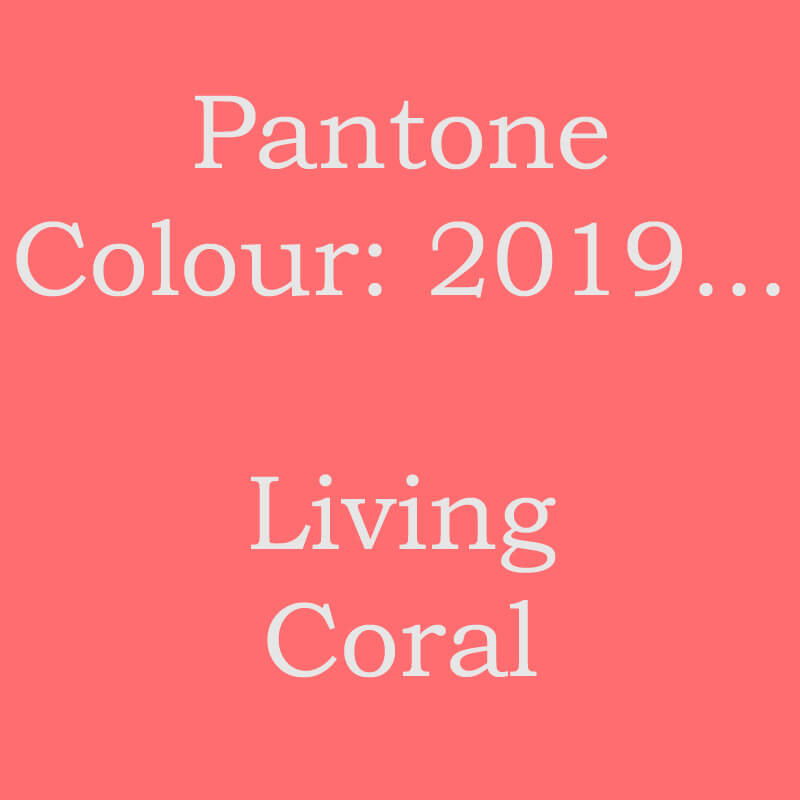
For 2019, the Pantone colour of the year is ‘Living Coral’, which looks like this…
 So, do you love it? Do you hate it?
If you’re a designer and you like to be on trend, then it’s worth trying to use this colour in your work, however you feel about it personally. But if you just bead for your own pleasure, then use whatever colour palettes you enjoy.
Having said that, I always like to encourage people to adventure into new territory. So, if this isn’t a colour you would normally use, could you try it?


Delicas that match the Pantone Colour of the Year
Bead colours are really difficult to match, especially if you are trying to buy online. So, to help you out, I’ve had a quick look through my own stash of Delicas.
Why the Delicas? Well, these all have a colour number which is used universally. So, you’re not trying to rely on retailer descriptions of colour. If you can match the colour number code, you know you are getting what you expect.
I can’t guarantee that any of these colours are the precise Pantone Colour, Living Coral. But this range is going to give you something that is along the right lines…
- DB2113
- DB207
- DB1481
You are basically looking for a shade that is pinky-orange. Maybe you call it deep peach. And yes, although ‘Living Coral’ is a specific, deep, colour, I think there’s nothing wrong with going for a lighter or darker shade of this if you wish.
What does this Pantone colour choice pair with?
I do love this colour. But I have to agree that on its own, it might be just a bit much! So, you are going to want to think about pairing it with another colour or shade. Where do you start?
Well, for a little practical fun, this colour theory beading project is something you can try>>
Just a few days ago, I launched a new beaded box, made with carrier beads. Now, I had just been reading about the new colour of the year. So, I thought why not try using it?
 Get the carrier beads beaded box pattern here>>
For this project, I paired it with Gunmetal. I found that a relatively small amount of the Living Coral went a long way! The gunmetal is a complete contrast, so it almost fades into the background against the vibrant Pantone shade.
Looking back through my pattern collection, I’ve obviously been a fan of this combination in the past as well! To be fair, this is a standard, ‘safe’ colour combination. Contrasting colours will always work to make a statement. You just need to think about the relative balance of the two.
 Get the Tila Herringbone Bracelet pattern here>>
In that bracelet, I used the tiniest amount of the pinky-orange shade. So, it just provides a little light relief against the otherwise dull, grey background. See how much the balance of colour affects the feel of the design?
Again, in the necklace below, although I paired the orange/pink with a different colour, I still used a relatively small amount. The intensity of this kind of shade means you can create impact without needing a huge quantity of the colour.
 Get the triangle cabochon necklace pattern here>>
More Pantone colour options
So, I’ve said that opposites will always work well together. So, if we take a look at the colour wheel, you would be looking at pairing this colour with blues or greens, maybe yellow.
How might that work?


Any combinations in there that you might want to investigate a little further?
How about if you try another idea from the colour theory ‘bible’. Shades that sit next to or close to one another on the wheel can work. But they can also clash. So, what if we put this living coral with red, orange, purple?


What if you take this literally and think about the colour itself. This Pantone colour is really a cross between orange and pink. So, what if you put it with those shades…?


Is this giving you ideas? Which colour combination speaks to you?
My own feeling is that colour is a personal choice. What you like and dislike will reflect your own personality in some way. So, there is really no right or wrong choice to make here. If you like it, then go with it and enjoy it.
The two most important factors to consider
So, yes, let me leave you with this thought for the day. When you are picking colours for your beadwork, what are the two most important factors you want to consider?
- Will you enjoy using the beads as you work?
- Will you enjoy wearing the finished article?
If you can answer ‘yes’ to both those questions, when you are looking at a colour, then go with it!
I hope this has helped you to think about the other two big factors: pairing and balance. Remember, you can get a pairing that is unconventional, but use it in the right balance and you will have a colour combination that works.
So, go on, if you’re looking for a New Year’s Resolution, how about…
Try using the Pantone Colour of the Year in my beading projects in 2019